Widget
Open “Widget” in the sidebar. Here, you choose which sections visitors see and how they open the window. To check it on your website, first connect the widget.
Access and permissions
Opening settings requires “View” in the “Widget” row. The first save requires “Create” and “Edit”; subsequent saves require “Edit”. The same permissions apply to “Appearance”. The account owner has all permissions.
Choose content and display settings
In the “Content” tab, enable “Updates”, “Checklists”, or both. “Open first” determines which section a visitor sees when both are available. Empty sections are hidden by default; if only one section is available, tabs are not shown.
In the “Display” tab, turn on “Widget enabled”. “Hide empty widget” removes the button if the visitor has no available updates or checklists. “Unread count” adds a counter for new updates to the button. Read entries remain in the history; drafts and content for a different audience do not make the button available.
Choose how to open it
In the “Widget layout” tab, choose “Floating button”, “Edge panel”, or “Custom button”.
For “Floating button”, set “Button text”, “Icon”, “Shape”, a corner under “On page”, and “Edge offset”.
For “Edge panel”, set “Panel text”, the icon, side, alignment, orientation, and offset. At the bottom, the panel is always horizontal.
For “Custom button”, copy the “Embed code” into your website's interface or add the
data-flowtomate-openattribute to an existing button:html<button type="button" data-flowtomate-open>What's new</button>The widget also works with buttons added after the page loads. It checks that content is enabled and available. Your website styles the button; the Flowtomate floating button does not appear in this mode.
Under “Window”, set the “Heading” and a “Width” from 280 to 640 px. In “Custom button” mode, the window opens beside your element and switches sides if there is not enough room.
Check and save
In “Preview”, switch between “Desktop” and “Mobile”, then choose “No content”, “Updates”, “Checklist”, or “Both sections”. The “Button” and “Window” switch lets you check both states. This is demo content; display on the website depends on published content and audience rules.
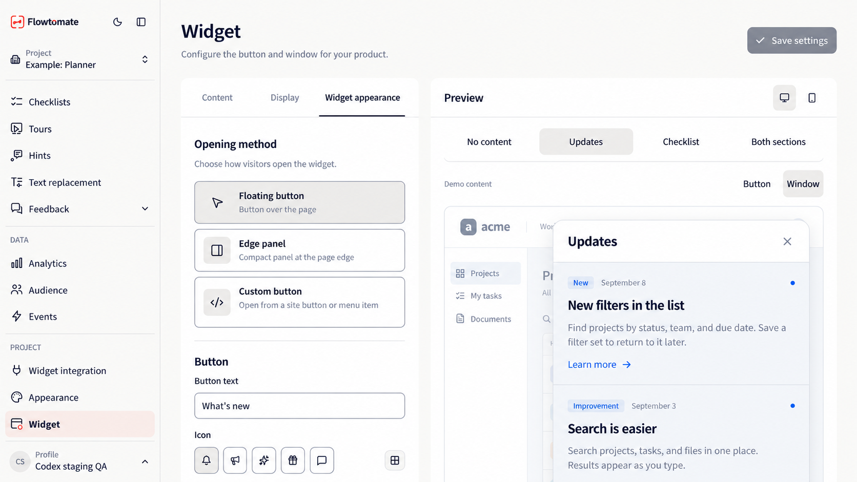
The “Widget layout” tab: button, window, and sample content. The preview does not confirm display on the website.
After edits, the status shows “Changes pending”. Click “Save settings” to apply them. “Discard changes” restores the last saved values.
Set colors and fonts in Appearance. For “Custom button”, your website controls the button's appearance, while Flowtomate styles the window.
Related guides
- Integration — connect the widget to your website.
- Appearance — change the shared color and font.
- Updates — prepare the feed for visitors.
- Troubleshooting — if the widget connection is not confirmed or content is not displayed.